In what ways have you selected and developed projects that were individually relevant?
If I thought after doing quick ideas that one idea was really strong/ clear then I continued on with that one. Because of the rapid nature of this project I felt these had to recognise quicker than usual.
How successfully have a full range of possible starting points been explored?
With the time given, an adequate amount of possible starting points were made including initial research to start each project, may this be artist research, reference and/or exploratory drawing.
What issues have had either a positive or negative effect on the realisation of your ideas?
Positive:
Time - because it forced me to come up with an idea and work quickly thus producing alot of work in a short amount of time.
Research - because it has allowed me to see what other artists have done on a similar topic/theme.
Blog - Allowed me to easily catalog my thoughts, reflective journal, and research.
Negative:
Time - because it meant that I couldn't complete as many workshops as I wanted compared to if each project was a full terms worth as in 1st and 2nd year.
Sketchbook - Still difficult to put together and makes me question myself in terms of 'is this meant to be this hard?'.
How have creative results been reviewed and evaluated?
In the sketchbook more note like and points and on a blog reflecting on the day, what we did and what I was trying to achieve.
What personal strengths have been identified or developed while completing this assignment?
I found that I can come up with ideas quite rapidly and be able to, if need, complete a brief in a day, which I think is quite important in the industry for we live in a increasingly more fast world where work can be produced and send in a millisecond. I think i've got used to using digital techniques to not only clean up my work but give it a professional finished look.
Thursday, 3 November 2011
Sunday, 30 October 2011
Workshop Eight - When You Tell A Story...
Research
Both - Tom Gauld & Simone Lia
This book is a good example of sequential imagary with little or no words. The illustrations are so rich of information that you understand what's going on clearly.
http://www.cabanonpress.com/index.htm
The Red Tree - Shaun Tan
Even though Tan's books have text the main part of each double spread is the illustrations which are very beautifully done.
http://www.shauntan.net/
The Peacock Party - Alan Aldridge
This book shows how you can use the small traits of animals and turn them into characters. I want to make my Selkie/seal man a character like this.
http://www.alanaldridge.net/index.html
The Great Selkie of Sule Skerry
1. The Story
The story is about a mother worrying about who the father of her son is and he comes to her in the night and tells her that he is a Selkie - A Man-Seal and that their son is also one too and he will be taking him back to the sea with him but tells her that she will meet a handsome, strong hunter and won't be alone though the first time the hunter makes a catch it will be the Selkie and their son.
3. This story would be part of an ongoing collection of 'Nautical Tails'
4.
One: Selkie Head explaining (Night Time)
Two: Selkie and Son leaving
Three: Returning to the sea
Four: Hunter
Five: Dead Selkie
Monday, 24 October 2011
Workshop Seven - Hurricane Workshop
Research
Ben Newman
This is a good mix of contemporary illustration and educational illustration. I also like that the sun has a face.
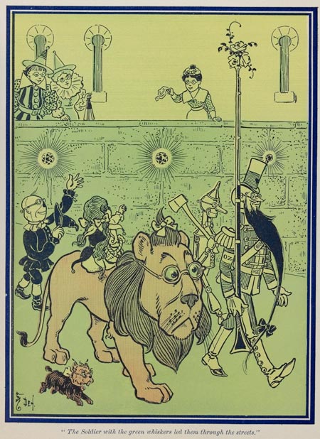
W. W. Denslow
Denslow was one of the original people to illustrate Oz and I really like the fact that he gives the characters more character by illustrating them in a certain way.
For this workshop I was stuck with how I was going to make an educational poster with all the instructions and also connect in the Wizard of Oz. The idea I came up with was to make Toto the Dog into a sort of war hero-esk character whose gone through one Tornado before. To give him more of that american hero look I gave him an eye patch. With Toto as a 'mascot' I could have him tell people the instructions and tackle to brief that way. So I did some quick spot illustrations of some of the instructions, with Toto pointing at them with his paw. Whilst doing this I realised that most of the instructions were about what to do in your home and I thought how I could use this, so to connect not only with the Wizard of Oz but young children, in particularly young girls, I illustrated all the instructions within a dolls house. Also to make it even more interactive for children I made it like an old DIY tornado kit, the illustration will be able to stand up and they can use a hair dryer to stand in for a tornado.
Friday, 21 October 2011
Workshop Six - Terrors of the Night
Research
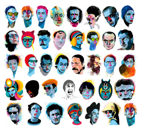
Alvaro Tapia Hidalgo
I really really like the style that this artist has got, the mix of solid black, clean lines with the use of intense colour and drips works really well, also alot of their portrait subject are to do with Horror.
Tom Whalen
In this workshop we had the choice of either doing an exquisite corpse image, full body shot of a character into head, torso and legs, or doing horror portraits of famous characters - Boris Karloff as Frankenstein's Monster, Anthony Perkins as Norman Bates, Christopher Lee as Dracula, Jack Nicholson as Jack Torrance, and Anthony Hopkins as Hannibal Lecter.
I chose to focus on the horror portraits because I wanted to challenge myself for last year whilst doing 'The Great Editorial Race' I realised that I was very poor at doing portraits and want to become better at it. Firstly I started with the portrait of Boris Karloff as Frankenstein's Monster because for me that's one of the most iconic horror images and whilst I was doing this piece of work I researched into Karloff and found out that he was one of the main people in most horror films of a time. Using the images of Alvaro Tapia Hidalgo as inspiration, firstly roughly light boxed around the image and then decided what was going to be blocked black, mid tone, or blank, then filled out accordingly. I then scanned this into the computer and started putting layers of green under the lines, I thought with the multiple lines over where I wanted mid tones this would make those sections look darker but it wasn't as clear as I wanted it to be so I darkened those areas more. I then turned down the opacity on the colour and put drips of blue behind the image, I chose blue because I think it complements with green in the face. To set the whole image off I put a dirty mustard as the background.
Alvaro Tapia Hidalgo
I really really like the style that this artist has got, the mix of solid black, clean lines with the use of intense colour and drips works really well, also alot of their portrait subject are to do with Horror.
Tom Whalen
I like the simplicity and colour scheme of each poster, just picking out the minimum amount of features to show the characters.
Charles Burns - Facetasm
Burns' style is very horrific especially in the collection of work he's entitled Facetasm where he's used the idea of an exquisite corpse and just focused it on the face. The use of block black and white works well with the horrific images he's creating.
In this workshop we had the choice of either doing an exquisite corpse image, full body shot of a character into head, torso and legs, or doing horror portraits of famous characters - Boris Karloff as Frankenstein's Monster, Anthony Perkins as Norman Bates, Christopher Lee as Dracula, Jack Nicholson as Jack Torrance, and Anthony Hopkins as Hannibal Lecter.
I chose to focus on the horror portraits because I wanted to challenge myself for last year whilst doing 'The Great Editorial Race' I realised that I was very poor at doing portraits and want to become better at it. Firstly I started with the portrait of Boris Karloff as Frankenstein's Monster because for me that's one of the most iconic horror images and whilst I was doing this piece of work I researched into Karloff and found out that he was one of the main people in most horror films of a time. Using the images of Alvaro Tapia Hidalgo as inspiration, firstly roughly light boxed around the image and then decided what was going to be blocked black, mid tone, or blank, then filled out accordingly. I then scanned this into the computer and started putting layers of green under the lines, I thought with the multiple lines over where I wanted mid tones this would make those sections look darker but it wasn't as clear as I wanted it to be so I darkened those areas more. I then turned down the opacity on the colour and put drips of blue behind the image, I chose blue because I think it complements with green in the face. To set the whole image off I put a dirty mustard as the background.
Next I went onto Christopher Lee as Dracula because I wanted to keep with the most well known classic monsters. Again, using the images of Alvaro Tapia Hidalgo as inspiration, firstly roughly light boxed around the image and then decided what was going to be blocked black, mid tone, or blank, then filled out accordingly. I then scanned this into the computer and started putting layers of blue and red (in the areas of blood) under the lines, unlike before with Frankenstein's Monster the multiple lines over where I wanted mid tones did make the sections look darker. Then once again I then turned down the opacity on the colour and put drips of red behind the image, I chose red to make the image look really bloody. To set the whole image off I put a darker blue as the background, I was going to use a black background to that meant the image was lost more.
Workshop Five - Matthew Robins
http://www.sadlucy.com/
To begin with we were introduced to Matt and his show puppets which looked really cool and he showed us how simple and effective show puppets can be even if the puppet itself is a tad rough the shadow still looks good. We were given an extract of text by Vic Reeves (which is good knowing the sort of eccentric guy he is) about him as a young man and how a great boar caused havoc on a farm where him and his friend was. The group then had a small meeting about who's going to do what and it was decided that we each make a pig and another farm yard animal, because we had two OHPs (Main scene OHP and general farm OHP), as well as part of one of the main scenes. Using the reference images we were told to bring int, I personally made a wee piggy and a hedgehog and then the lassoing farmer. Once the characters were made I decided that we could use some green acetate and make a background for the farm to give it more character. We then performed our little piece in the lecture theatre before Matt's official talk about his work, for this I became Vic Reeves for a bit being the narrator of the story.
Workshop Four - Taxonomy of Birds
Research
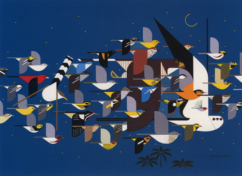
Charley HarperHarper's way of illustrating is very stylised and simplified. The illustration above shows how he can do the bare minimum bit still show the characteristics of each bird so that they're still recognisable.
http://www.charleyharperprints.com/
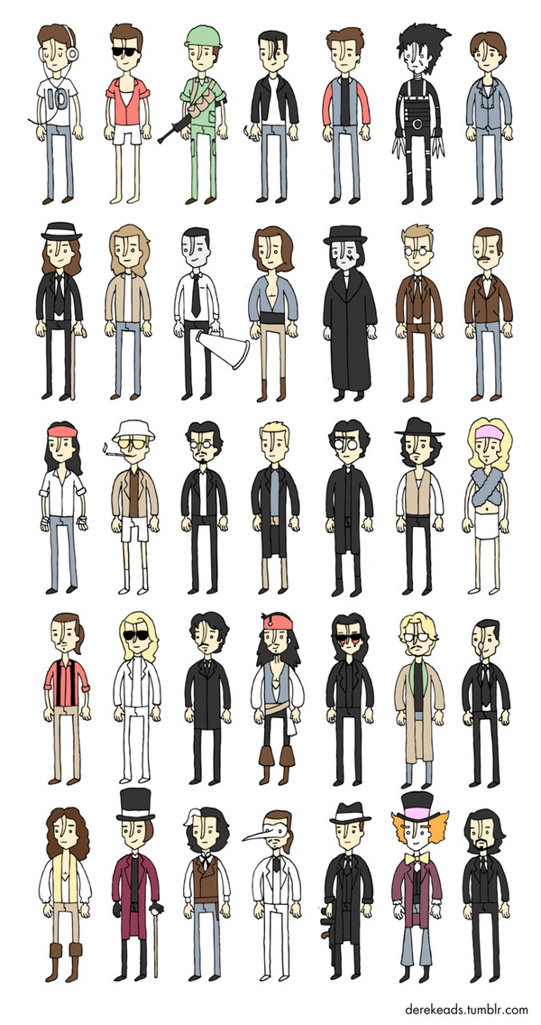
Derek Eads
This illustrator is very good at making collections of small illustrations, usually to do with films/actors.
http://society6.com/artist/derekeads
http://derekeads.tumblr.com/
Adventure Time
This cartoon from Cartoon Network is very stylised and like Harper does very simplified characters like Jake the Dog, you can tell he's a dog but he is very simplified.
http://www.cartoonnetwork.com/tv_shows/adventuretime/index.html
James Curran
http://www.slimjimstudios.com/
To start the workshop off we were told that we were going to the museum to sketch birds which I was looking forward to in one way because it meant I could work on my drawing skills though I thought it would be better if the birds were alive and were flying around and landing on people whilst they're drawing. Firstly we were asked to do quick line and tonal work and then to choose one bird and go into a meditational state and draw every last inch of it, I chose a magpie to draw because I wanted to challenge myself and try and still get different tones black. Once this was done we were told to stylise the image we'd just made is as many ways as possible. When I looked at my illustration of the Magpie I realised two things: one - it had a cocky eyebrow raised and two - that it's tail defines it, because though the most recognisable thing about a magpie is it's black and white feathers but without the tail it's quite hard to tell it apart from a black and white image of any bird. So with the raised eyebrow the magpie looked a bit roughish/cocky so I thought he could be like a bandit/criminal, and this fitted with the colours of black and white. So firstly I did lots of quick sketches using various mediums and styles to just see what I could do in a little bit of time, then I worked more on turning the magpie into more of a character. In the end, inspired by the workshop before, I made the magpie, Clockwork Orange Magpie. Then using the images of Charley Harper as inspiration I tried to make the magpie out of simple shapes, and using the fact of the tail, I could make the body pretty much any shape and as long as the tail was added with the black and white of course it looked like a magpie.
Workshop Three – Kitchen Confidential Task
Research
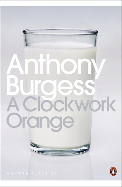
A Clockwork Orange - Anthony Burgess
When we were first given the brief I had no idea who Anthony Bourdain was, so I did a little bit of research on him to get an idea about who he is. I read and was told that he lived a colourful life, drugs, apart from food, being a large part of it. I then read the extract of text we were given from the book about Bourdain's experience of going to a japanese fish market. I started sketching out certain fish that were mentioned in the passage, blow fish and sword fish especially, turning the sword fish into a needle and the blowfish covered in needles and, because of it's name, filled with cocaine/blow. I then went on a tangent and took a part of the text talking about piles of fish like Easter Island heads and illustrated it using a repeated black and white fish pattern. I decided then with the opinion of others that I should use the image of the swordfish needle for the cover of the book, but I improved the illustration by using the repeat pattern i'd done for the easter island for the substance inside the needle to show that food is a drug for Bourdain. I then scanned this into Photoshop and wanted to make the cover like that of a clockwork orange. So I put the image in a similar position but it didn't have the same effect so I thought how can I use this image to still show that it's about food. Then I thought I could do a surreal image of a few swordfish needles jumping out of a pan of water as if it's the sea. I made the pan just simple shapes so that it didn't detract from the swordfish. For the title I used Impact because on the original front cover the font looks a lot like it.
A Clockwork Orange - Anthony Burgess
I like, knowing the story, how foreboding this image is and how minimalist it but it works so it needs nothing else.
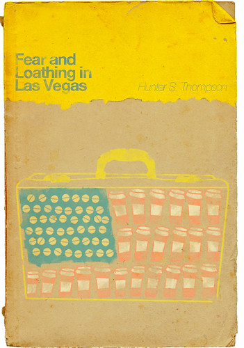
Fear and Loathing in Las Vegas - Hunter S. Thompson
I like, again, the minimalist look of this cover and also like the above image, it is the origin of craziness of the story. This image has more to do with the cover i'll be creating because of the drug connotations, though obviously this is done in a more obvious way.
American Psycho - Bret Easton Ellis (Illustrated by Marshall Arisman)
This illustration shows how an book cover illustration can add to/define the book. I also like the surrealness of it.
When we were first given the brief I had no idea who Anthony Bourdain was, so I did a little bit of research on him to get an idea about who he is. I read and was told that he lived a colourful life, drugs, apart from food, being a large part of it. I then read the extract of text we were given from the book about Bourdain's experience of going to a japanese fish market. I started sketching out certain fish that were mentioned in the passage, blow fish and sword fish especially, turning the sword fish into a needle and the blowfish covered in needles and, because of it's name, filled with cocaine/blow. I then went on a tangent and took a part of the text talking about piles of fish like Easter Island heads and illustrated it using a repeated black and white fish pattern. I decided then with the opinion of others that I should use the image of the swordfish needle for the cover of the book, but I improved the illustration by using the repeat pattern i'd done for the easter island for the substance inside the needle to show that food is a drug for Bourdain. I then scanned this into Photoshop and wanted to make the cover like that of a clockwork orange. So I put the image in a similar position but it didn't have the same effect so I thought how can I use this image to still show that it's about food. Then I thought I could do a surreal image of a few swordfish needles jumping out of a pan of water as if it's the sea. I made the pan just simple shapes so that it didn't detract from the swordfish. For the title I used Impact because on the original front cover the font looks a lot like it.
Workshop Two – Taking Direction/Barnet Fair
Research
Victorian Posters
Looking at Victorian posters i can see see that the colour schemes are usually quite minimal; blacks, off whites, and reds
Adrian Johnson
This is the style i'd like to go for with this workshop.
http://www.adrianjohnson.org.uk/home
Ben Newman
Again this is the sort of style i'd like to have in my final piece, this one even more for the use of Newman's limited colour palette.
http://www.bennewman.co.uk/
When we first got given the brief we were told we had to choose between two different quotes to illustrate:
Quote One (reference either Pulp fiction covers or 1950s Advertising)
“How do I control my life when I can’t control my hair?” – anon
Quote Two (reference Victorian posters)
“BLESS the HAIRDRESSER.
He attacks Mother Nature for a small fee.
Hourly he ploughs heads for sixpence,
Scours chins and lips for threepence.
He makes systematic mercenary war on this
WILDERNESS.
He trims aimless and retrograde growths
Into CLEAN ARCHES SHAPES and
ANGULAR PLOTS.
BLESS this HESSIAN (or SILESIAN) EXPERT
correcting the grotesque anachronisms
of our physique.” - Wyndham Lewis
I chose quote two to illustrate because even though the mass amount of text needs to be put in the illustration, the text itself can inform the illustration better than the other quote.
When reading through the quote it was obvious to me that the hairdresser is described to be able to do many tasks and with the first line of “BLESS the HAIRDRESSER” I see him being like a god, like Vishnu or Ganesh. I decided then that the barber should be multi armed in order to be God like and to be able to do all the tasks that he’s able to do at the same time. Also in cartoons when a character’s doing multi tasking at high speeds it is drawn like they’ve got multiple arms and to add to the godliness of the barber character I put beams of light coming out of him.
Friday, 14 October 2011
Workshop 1 - Rhyming Slang Task
Research
Dan Hillier
This is a perfect example of what i'd like to with accomplish with my final piece a mix of juxtapositioning and victorian art.
http://www.danhillier.com/#/?image_id=ae_01
Gemma Robinson
I like the simplicity of these images, making them really easy to read and understand, this is what my final poster image needs to be.
http://www.gemma-robinson.co.uk/newwork.htm
Steve Edge
First when we were given the brief I looked at the cockney alphabet we were given. The first thing that jumped out at me, it’s illustrative qualities, was Cat and Mouse – House. I wanted to make it that the cat made up the main part of the house and the mouse is the door, like the cat is looming over the mouse forebodingly because it’s about the pounce. This idea wasn’t as clear as I wanted it to be, for it was hard to make the shape of the cat still look like a house. The next rhyme that caught my eye was Jackdaw – Jaw, which made me think of the pedigree chum ‘dentastixs’ with dogs with oversized human teeth which is not only funny but makes it very obvious in the image what they’re trying to mock-sell.
For my illustration I sketched out an idea of what I wanted the image to look like; to keep the image quite simple so as to make the teeth really obvious, I illustrated the Jackdaw as a silhouette and filled it in with cross hatching to make it look interesting shadowy and still slightly feathery looking then gave it big teeth which I kept starkly white. I then asked people what they thought and they said that this one was the strongest/clearest image, out of the selection I’d drawn, to read so I then upped the scale and redrew the Jackdaw to A2 and also added typography around the body, the text was inspired by the Chat Noir poster which I thought the Jackdaw sort of reminded me of.
I then took this image to the photocopier and experimented with some colour in the background though this turned out to be more difficult then I first thought, for I still wanted to keep the teeth quite starkly white which is difficult to do then adding multiple layers of colour. In the end I made something that sort of worked though I was still not happy with it as a finished piece so I scanned it into Photoshop and cleaned it up and experimented again with background colours thinking more about what would it be like if it was an old poster. In the end I came up with something that looks worn, seedy and slightly sinister. I thought then, what would it be a poster for? Then I thought what if it’s the poster for a toothpaste, so I made mock up of what the tooth paste would look like.

Dan Hillier
This is a perfect example of what i'd like to with accomplish with my final piece a mix of juxtapositioning and victorian art.
http://www.danhillier.com/#/?image_id=ae_01
Gemma Robinson
I like the simplicity of these images, making them really easy to read and understand, this is what my final poster image needs to be.
http://www.gemma-robinson.co.uk/newwork.htm
Steve Edge
This is the sort of style I want for my work for it looks like an old London poster you'd see in Victorian Britain.
First when we were given the brief I looked at the cockney alphabet we were given. The first thing that jumped out at me, it’s illustrative qualities, was Cat and Mouse – House. I wanted to make it that the cat made up the main part of the house and the mouse is the door, like the cat is looming over the mouse forebodingly because it’s about the pounce. This idea wasn’t as clear as I wanted it to be, for it was hard to make the shape of the cat still look like a house. The next rhyme that caught my eye was Jackdaw – Jaw, which made me think of the pedigree chum ‘dentastixs’ with dogs with oversized human teeth which is not only funny but makes it very obvious in the image what they’re trying to mock-sell.
For my illustration I sketched out an idea of what I wanted the image to look like; to keep the image quite simple so as to make the teeth really obvious, I illustrated the Jackdaw as a silhouette and filled it in with cross hatching to make it look interesting shadowy and still slightly feathery looking then gave it big teeth which I kept starkly white. I then asked people what they thought and they said that this one was the strongest/clearest image, out of the selection I’d drawn, to read so I then upped the scale and redrew the Jackdaw to A2 and also added typography around the body, the text was inspired by the Chat Noir poster which I thought the Jackdaw sort of reminded me of.
I then took this image to the photocopier and experimented with some colour in the background though this turned out to be more difficult then I first thought, for I still wanted to keep the teeth quite starkly white which is difficult to do then adding multiple layers of colour. In the end I made something that sort of worked though I was still not happy with it as a finished piece so I scanned it into Photoshop and cleaned it up and experimented again with background colours thinking more about what would it be like if it was an old poster. In the end I came up with something that looks worn, seedy and slightly sinister. I thought then, what would it be a poster for? Then I thought what if it’s the poster for a toothpaste, so I made mock up of what the tooth paste would look like.

Subscribe to:
Comments (Atom)


