Research
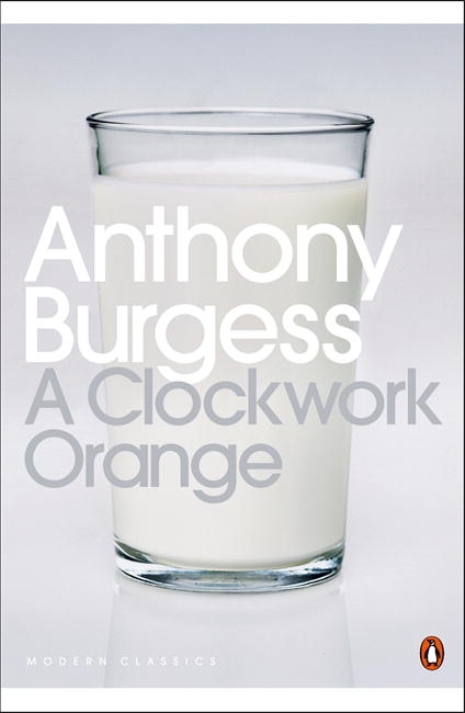
A Clockwork Orange - Anthony Burgess
I like, knowing the story, how foreboding this image is and how minimalist it but it works so it needs nothing else.
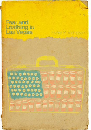
Fear and Loathing in Las Vegas - Hunter S. Thompson
I like, again, the minimalist look of this cover and also like the above image, it is the origin of craziness of the story. This image has more to do with the cover i'll be creating because of the drug connotations, though obviously this is done in a more obvious way.
American Psycho - Bret Easton Ellis (Illustrated by Marshall Arisman)
This illustration shows how an book cover illustration can add to/define the book. I also like the surrealness of it.

When we were first given the brief I had no idea who Anthony Bourdain was, so I did a little bit of research on him to get an idea about who he is. I read and was told that he lived a colourful life, drugs, apart from food, being a large part of it. I then read the extract of text we were given from the book about Bourdain's experience of going to a japanese fish market. I started sketching out certain fish that were mentioned in the passage, blow fish and sword fish especially, turning the sword fish into a needle and the blowfish covered in needles and, because of it's name, filled with cocaine/blow. I then went on a tangent and took a part of the text talking about piles of fish like Easter Island heads and illustrated it using a repeated black and white fish pattern. I decided then with the opinion of others that I should use the image of the swordfish needle for the cover of the book, but I improved the illustration by using the repeat pattern i'd done for the easter island for the substance inside the needle to show that food is a drug for Bourdain. I then scanned this into Photoshop and wanted to make the cover like that of a clockwork orange. So I put the image in a similar position but it didn't have the same effect so I thought how can I use this image to still show that it's about food. Then I thought I could do a surreal image of a few swordfish needles jumping out of a pan of water as if it's the sea. I made the pan just simple shapes so that it didn't detract from the swordfish. For the title I used Impact because on the original front cover the font looks a lot like it.


No comments:
Post a Comment