Showing posts with label Project 2 - Self Promo. Show all posts

Tuesday, 29 May 2012

HE Fashion Show


Harriet Isaacs (a damn good graphic designer) and I were asked to make a font cover for the up and coming HE fashion show featuring Plymouth College of Art fashion student's work in Plymouth Pavilions. The brief was to use two image as inspiration:

We were also given the theme of 'Edwardian Plymouth' so we had to create something was quite old looking but also quite now and fashionable which was a bit of a tricky brief but we just slowly pieced it together starting with the top image as the main piece of inspiration then just working parts of the bottom image as well as things like a compass and light to show Plymouth/the sea. 
We were also asked to make a mood board on the same theme which again was tricky but interesting because we firstly needed to work out what needed to go on a mood board in the fashion world, but I was very please with the outcome and when we handed in both pieces it was praised which was good and I put my name as Bench Allen on it so it was a good way to spend the name out there. 

Easy Fold Book & Box


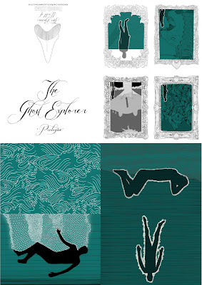
To make the ghost explorer more accessible to people and also so I could sell it at fairs and use it as a piece of self promo, I made easy fold versions of the hard bound book. I broke the book into three chapters, I've only made an easy fold version of the first chapter (which I have entitled prologue) so far for the deadline but the Plymouth College of Art Summer Show 2012 I want to make multiple versions of all three chapters.
For this project I wanted to find a new way of packaging my easy fold book so I asked Laura if she could show me how to make the boxes she makes for her Resin toys. I decided i'd use cream card for the top of the box and blue for the bottom because it looked like sand/rock and the sea which obviously works for the story of the ghost explorer. I then digitally printed the title on the top and put them together which ended up being very tricky and fiddly without nails but they were done.
I then completed the package with a business card. For the summer show and New designers I was going to make little goodies like laser cut badges and prints in there as well so that it's more of a promotional package.

Monday, 28 May 2012

Tumblr

To get more people seeing my work I joined Tumblr, the good thing about tumblr is that I can put up my art work and other people can re blog it and therefore spend my work around and also I have linked all my images to my blog so more people can look at my entire work. Another thing is that I can re blog other people's stuff so I've been reblogging other people's work on the course (as you can see I've recently reblogged Kelly Walton's work) so that we can all help one another spend our work around.

Blog

I made benchallen.blogspot.com in the second year and therefore the whole thing seemed a bit dated with my old business card image as the banner and the colour scheme was black and white to tie in with the flash catalyst website I made in second year too. Firstly I changed the colour scheme to a nautical blue so that it worked with the work I was putting on the blog. Then to tie in with the new identity/ logo I made a new banner.
Though I didn't really like this banner for I had to use two teeth to fill the space and also because the background is white it didn't fit in with the layout very well.
The banner I tried next was to just have the tooth by itself with the same coloured background as the blog so it looks like it's just there by itself, the minimalist look. Though you couldn't see the tooth very well so I put a rough white border around it though it still wasn't working as a blog banner. 
  
The final banner I came up with was the tooth with the writing underneath (which I changed from black to white so it's more legible) on the same colour background as the blog, which I think works perfectly. 
 

Website


Researching into successful up and coming contemporary illustrators I can see and was majorly advised to make a cargo collective website. It did mean code had to be worked out to sort of the orientation of the work but because so many people have a cargo website most questions are answered and also I had help from Laura Jayne Weeks for she has already made hers and it look really good.
I was really pleased with how my website looks though there are still pieces of work that need to be uploaded and the logo added.

Animation

This is a rough idea of what I want the final animation to look like on the self promotional cd.
I wanted to use the imagery I made for the business card have everything tie in to this identity i've made of The Bazaar World of Bench Allen.

Sunday, 27 May 2012

Business Card

For the business card I wanted to use the new shark tooth identity. I came up with 'Thee Bazaar World of' from thinking about what sort of what it would be and bizarre was a good word to describe the sort of world I have made as Bench Allen but then I thought because of doing fairs and selling things off my own back that my world is like a market bazaar.
I liked the font I used in the Ghost Explorer and thought it would be perfect for this part of the logo.
I kept the 'Bench Allen' the same as i've used before because I like the bold hand drawn look of it and I think it still works with the font of 'Thee Bazaar World'. 
For the web address and email I wanted to have a clear clean legible font that is easily read even when small.
For the other side of the business card I wanted to show something that looked like a globe/world that in the mouth of a sea creature and with the shark's tooth on the other side I thought it made sense that it's a shark though when I did the illustration I did it A4 and when I put it on the business card dimensions it didn't fill the entire page so I put the same writing on this side as well though I did want to change it so that it was only the art work on this side. 

It was then given to me that I could turn the head slightly and increase the size and this would fill the business card more, though once this was done it looked like the shark was coming out of nothing so I put a line across the illustration to look like the surface of the sea and made it Palincest blue to hark back to that project, for that work will also be in my portfolio. 


Identity

For this part of the project I wanted to create more of a world for Bench Allen to exist in. To do this I wanted to make some sort of logo/ identity.

After lots of different ideas a strong idea was create, the tooth of a shark because for as long as I can remember I have always been interested and scared of sharks. Also the tooth is a strong shape that stands out and obviously keeps with the nautical theme of my work. Though the first sharks tooth I illustrated was the same look as the one I drew in my sketch book and people said it wasn't obvious enough that it was a sharks tooth.

So I changed it to a more obvious shape which turned out better because there's space now to put writing under the arch.

Monday, 16 April 2012

Research

Research -

The Shrine/ An Argument  - Fleet Foxes


Matthew Robins - Shadow
Thom Yorke - 

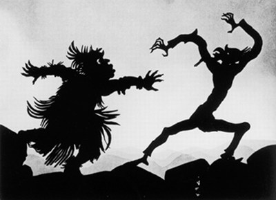
Lotte Reiniger - The Fairy Tale Films