Showing posts with label 1.3 - Finishing. Show all posts

Tuesday, 29 May 2012

Easy Fold Book & Box


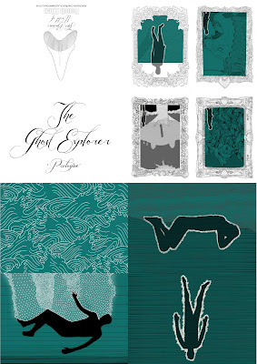
To make the ghost explorer more accessible to people and also so I could sell it at fairs and use it as a piece of self promo, I made easy fold versions of the hard bound book. I broke the book into three chapters, I've only made an easy fold version of the first chapter (which I have entitled prologue) so far for the deadline but the Plymouth College of Art Summer Show 2012 I want to make multiple versions of all three chapters.
For this project I wanted to find a new way of packaging my easy fold book so I asked Laura if she could show me how to make the boxes she makes for her Resin toys. I decided i'd use cream card for the top of the box and blue for the bottom because it looked like sand/rock and the sea which obviously works for the story of the ghost explorer. I then digitally printed the title on the top and put them together which ended up being very tricky and fiddly without nails but they were done.
I then completed the package with a business card. For the summer show and New designers I was going to make little goodies like laser cut badges and prints in there as well so that it's more of a promotional package.

Sunday, 27 May 2012

Book Binding & Finished Book


Firstly to make the book  I trimmed all the pages so that they lined up with one another and then I sewed all the pages together adding on the title page and the hand made marbling paper end pages.
One difficulty with this was that I couldn't trim or sew the book like you normally would because of the fold out pages with the quadruples on, in the end though the book sewed together fine although they could have been a bit tighter though the quadruple sewed in fine. 
I then cut the screen printed calico to size to make the hard back front cover. I then measured the card that makes it hard back, about 1cm longer and 5mm wider than the bound pages and worked out by the thickness of the bound page the size of the spine. I then laid out the card on the backside of the cover to work out where I was going to glue them, I then rollered out a thin layer of PVA glue on the card and stuck them to the cover, the corners of the calico where then cut and the extra material was wrapped around the card, this needed to be done ultra quickly so that the glue didn't dry. I then put a thin layer of glue on the card and stuck the marbled paper to it, the book was then pressed under the weight of a pile of books. I was then done.


Printing

I was a bit worried about printing the pages because the front cover was exactly A4 but then I realised that when you print there is a good enough boarder around the page so that it would work. Firstly, I did a test print on the black and white printer on normal paper and it came out looking good so I decided to put in the hand made paper I'd acquired in Totnes.

Unfortunately, because of the texture of the paper some of the images came out unclear and even more the ink didn't stay on the paper and smudged therefore I was unable to continue using it. So I decided to just continue using normal printer paper but this made the page look cheaply printed which I didn't want so I then bought some nicer thicker paper.


Though still in black and white the image looked quite cheaply produced and another thing was that because I was flipping the paper over in the printers the two middle lines on each side of the page didn't line up. So I went down to Bretonside printers to get it printed on the same paper but in colour so that they could line up the pages better and also I was going down there to print out the A3 quadruples anyway. They came out really nice and I was really pleased with the end result.

Adding in Words

For this project, unlike projects i've done in the past, I wanted to add in words to tell the story so that the illustrations didn't have to tell the story by themselves. Though once I started adding in words to the illustrations it ruined it slightly or the words were too illegible. The answer I came up with and was backed up was to put all the writing in the beginning of the book as a sort of poem/sea shanty, which works a lot better for me and for the book in all.

Front cover

For the front cover I used the iconic image from page 6 but simplified it because I wanted to screen print the front cover so I just made the lady a soft silhouette of cream which I thought really worked because the ghost explorer is a harsh black silhouette.

For the font I wanted to have a quite hand drawing font which looks like it's been written with a quill and ink but still legible and the font I found worked perfectly for that though I was a tad worried about how it was going to come out when screen printed.

When mixing the ink colours for screen printing I realised the cream I wanted for the lady/aura was a tad too light for I wanted to make my front cover out of calico because it was close to material I used in the book binding day. So I made a more golden colour so that I still showed up when printed.

Unfortunately because the print was a three colour print the lining up wasn't perfect although the images themselves came out really clear, even the type which was good.