Edition Biografiktion
When at The Cheltenham Illustration Awards these guys did a presentation on what they do:
'Edition Biografiktion is: Ana Albero, Till Hafenbrak and Paul Paetzel.
On meeting each other on the Illustration course at the University of Arts in Berlin in 2008 they founded their collective. Their first publication “Biografiktion” is a comics magazine, where, in each issue, the three Illustrators tell fictional stories about a celebrity.
Their screenprinted edition “Human News” is more focused on their illustration work.
Ana, Till and Paul also release limited prints and solo books editions.
To produce their artwork they use silkscreen, lino-cuts and photocopiers.'
This was quite a big inspration to me and my Collabo partner Laura Jayne Weeks, not only because of the screen printed art work but for the fact that made books on an open theme and then each of them tackled the theme in their own way. In the future this is the sort of thing i'd like to be doing.
Rose Blake
From Kingston graduate Rose Blake comes a tale of the origin of her most understandable phobia of that nefarious airbourne vermin - the pigeon. Printed in 4 colours on a beautiful Rives printmakers paper, Coo is limited to an edition of just 50 copies, all signed and numbered by the artist’s hand.
This book showed me that my pattern based illustrations could work when screen printed, it also showed me that it is possible to make an entire screen printed book. She has also chosen a really good colour pallet which works well with what she is trying to communicate.Planning & Illustrating
Wolf-
Research -
Twilight
Even though this is an odd starting point I remember seeing a clip of this part of the film with the one of the wolves leaving at one of the vampires in slow motion on a BT advert and the image of it has just always stuck in my mind. As I started drawing what was in my head though, I realised that in terms of the angle it was hard to get it right, tried a few times to no avail so I decided to change my decision although me and Laura discussed that we wanted wolves on the pages next to one another. I then thought about where the habitats of wolves are - the Tundra, mountainous regions etc, I thought it would be cool to draw a mountain range and have the iconic image of the wolf on the top howling to the moon. Though I thought 'how will I make the mountains look interesting and not just block colour?', recently because of the session that we are in, Winter, I have been liking thick knitted jumpers/cardigan and fortunately enough was bought one for christmas:
This got me thinking further about how pattern based the jumper designs are and also talking at the same time to friend about how cold it is in Scottish mountains where he was recently, putting the two together I came to the conclusion of Mountains with Jumpers!
Sanna Annukka
This was the sort of style I was trying to go for when creating the mountains with jumpers, Sanna Annukka is part Finnish and you can defiantly tell that she is influence quite heavy in her work by this. I like the decorative style that she has and her colour palette is perfect for what is needed every time.
Totem -
Research -
Ben Newman
When I first saw this is the 5th issue of NoBrow it blew my mind, then when I went onto the NoBrow website and it showed a step by step guide on how he made the image (link above) I wanted to use this in some way in making my own totems, expanding on the research and work it did for second year major studies.
Bug collection -
Research -
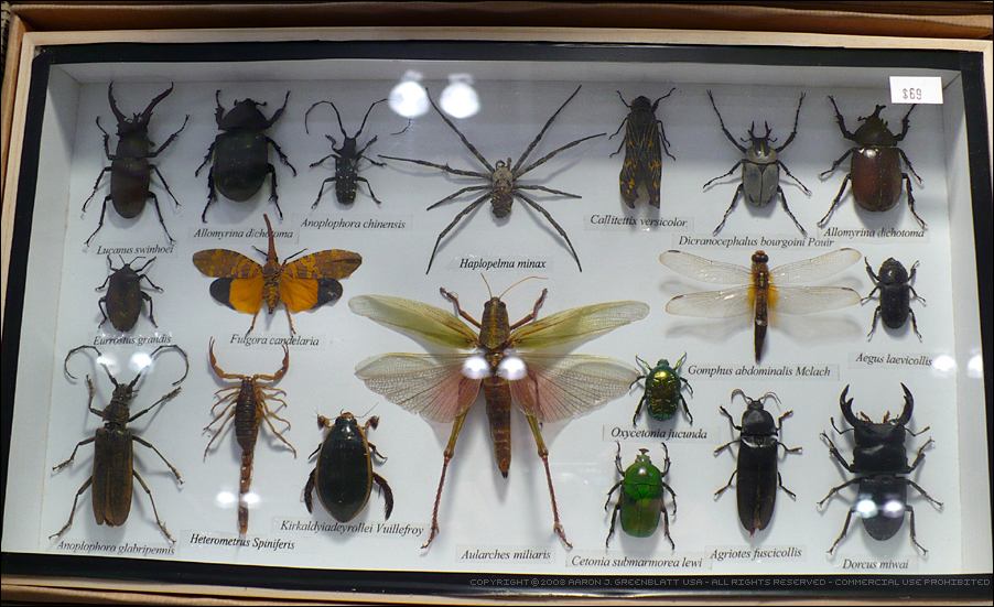
From an early age I've always been interested in bugs, collecting them, keeping them in jars, looking at them under a very cheap microscope. I also like the illustrative qualities bugs have and when they're put in cases in museums, how they're laid out with all their latin names underneath. One thing i'd like to do in the future is make an scientifically illustrated book of bugs for i've always enjoyed that sort of book and have many of my own.
There are very few contemporary illustrators that I could find who were doing similar illustration to mine but I did find this little gem which I really like and would like to use a similar method in the future drawing simple bug shapes and putting them together in a pattern.
Cave -
Research -
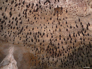
This image was the main reason why I wanted to make this illustration, this photo was in an animal Filofax about vampire bats and it's stuck with me every since. There's something about the bat where he's a cheeky little chappy and I want to get that within the illustration I make.
Also when they hang from the ceiling of caves they make an interesting pattern.
They also have bloody (no pun) unusual looks. In the future i'd like to do more illustrations of bats for as the image above shows they do really come in all shapes and sizes.
Deep Sea -
Research-
Research-
http://watchdocumentary.com/watch/the-blue-planet-episode-02-the-deep-video_d5868e445.html
The biggest amount of inspiration for this illustration from watching this episode of blue planet, it's good to see the creatures i'm drawing in their natural habitat. Also one thing i like to illustrate is sea monsters and it's good to look and sketch/draw the creatures that are no doubt the inspiration for these creatures and it's even said in the programme that Ridley Scott's inspiration for the look of Alien came from a
creature of the deep.
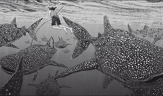
Jens Harder
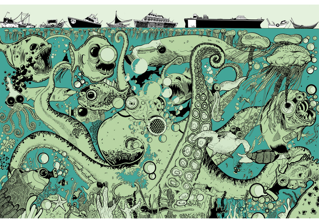
This illustrator is just amazingly amazing! Everything I do and would love to do in terms of illustration he does. I first saw his work in the first issue of Nobrow (which again was a massive inspiration not only for this illustration but for the whole project in terms of a collaborative project on one topic and also colour scheme and limited palette) and it blew my mind then when I went on his website I realised all his work is really detailed ink work based mainly in the sea.
He also has created a wordless graphic novel:
'Jens Harder’s Leviathan is a graphic novel in the truest sense. Harder uses scratchy but fluid images to tell the story of a mystical whale who battles a giant squid, saves Noah’s ark, attacks the Pequod, wreaks havoc on a cruise ship, and eventually battles an armada of anachronisms. The only text Harder employs in Leviathan are excerpts and quotes from a variety of sources including the Bible and a host of philosophers; the bulk of quotes come from Melville’s Moby-Dick. Just as that novel begins with an “Etymology” followed by a section called “Extracts,” Harder begins with a section called “Leviathanology,” a collection of quotes about leviathans from the likes of Hobbes, Milton, and the book of Job. These quotes inform the story of Leviathan, connecting the whale to a sublime and unknowable mystery that Harder will explore. Harder’s surreal images often invert notions of “proper” space and time, giving the whale an awesome significance, but also positing the beast as something that denies signification. By eschewing the traditional forms of graphic storytelling, which rely on speech bubbles and clear-cut panel transitions, Harder is able to capture something that is essentially too large to capture.'
This is actually what i'd like to create in future.
Tim McDonagh
This illustrator's work always seems to show a lot of layers within in them, using very fine ink line work, I hope to perfect my style in this way in the future.
Polar Bear -
Research -
Golden Compass
This image from the film of the Philip Pullman's Northern Lights/ The Golden Compass really did stick in my mind showing how the aura borealis/northern lights is made up from a thing entitled 'dust' and
people are able to access it through their dæmons which is meant to be the manifestations of someone's soul. In this image you can see how this works, this made me think what if the Inuits believed the northern lights came from an ancient polar bear.
Tang Yau Hoong
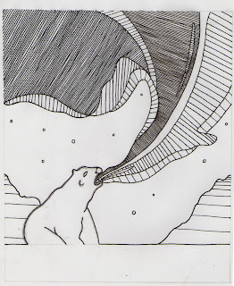
This artist's work uses a lot of negative space in their work. The image above inspired the layout of the illustration I made.Frozen Planet
Recently this programme has been on and I wanted to use it in a piece of illustration work and this project was the perfect time to.
Printing
Once all of the illustrations were made they were scanned into the computer and were cleaned up on Photoshop:
Once this was done colours were added to see what they'd look like when screened printed:
Once all the images were completed a digital printed mock up book was made so that we could work out what illustration was going where and what illustration was going next to one another:
Then once this was done each the blue and grey layer was colour overlay-ed with black:
 |
| Grey Layer |
Once this was done each layer of each page was printed on acetate, then all the pages were laid out and organised into blue and grey layers, then were divided into certain screens and then exposed. Both
colours were then mixed up as close to the digital colours as possible. Then the action commenced!
Before we started screen printing a quest to Totnes was had to purchase hand made paper because we
wanted the book to have a layering of it's own and also to make it look more professional. When we
started screen printing we started to realised that the images were bleeding quite a lot and after lots of
different way of trying to stop it we realised that it could be because of the paper so we decided that we would continue using the hand made paper but also use cartridge paper as well. Once we started printingon the cartridge paper we realised that it was the hand made paper which was the reason for the bleeding because when it was printed on cartridge paper it came out a lot cleaner. Once all the pages were done I printed a couple of t shirts and tote bags as well.
Agency -
As many examples of other illustrators that are doing similar work or work that I'd like to do in the future, are all involved with NoBrow in some way or another may it be in there main collective publication or small press limited edition books and prints. Though unfortunately they have limited illustrators on their books and the way they find people is through popularity/ work of mouth etc and a lot of people seem to want to be on their books and you can see why. Though saying all this they seem to be expanding quite rapidly at the moment so there's more opportunities arising all the time.
Handsome Frank
'Handsome Frank is an illustration agency representing some of the most talented and original commercial illustrators in the UK. Commissioning work for the advertising, editorial, publishing, retail and music industries, we match creative talent with client direction and manage the process from conception to completion.'
I found this agency through looking at Tim McDonagh and because I saw a connection between mine and his work I thought this would be a good agency for me to look into and also it doesn't seem to be too saturated with loads of illustrators on their books.
Society 6
"Selling your artwork as a product on Society6 is as simple as making a Post - except you make money from it. All you have to do is post your artwork to make it immediately available for sale as a variety of products. When you sell a product, we'll produce it, package it and ship it for you, so that you can focus on making more art! "
This agency is a good way of getting my work out there as well as being able to sell it. Also a good thing with this agency is that they can print work on a range of things like mac book & Iphone cases, t shirts, and just simple prints and it's really easy to join, just sign up and upload work and you're away.
Other Agencies
Big Active.com
http://www.nineteenseventythree.com/


