
In what ways have you selected and developed projects that were individually relevant?
If I thought after doing quick ideas that one idea was really strong/ clear then I continued on with that one. Because of the rapid nature of this project I felt these had to recognise quicker than usual.
How successfully have a full range of possible starting points been explored?
With the time given, an adequate amount of possible starting points were made including initial research to start each project, may this be artist research, reference and/or exploratory drawing.
What issues have had either a positive or negative effect on the realisation of your ideas?
Positive:
Time - because it forced me to come up with an idea and work quickly thus producing alot of work in a short amount of time.
Research - because it has allowed me to see what other artists have done on a similar topic/theme.
Blog - Allowed me to easily catalog my thoughts, reflective journal, and research.
Negative:
Time - because it meant that I couldn't complete as many workshops as I wanted compared to if each project was a full terms worth as in 1st and 2nd year.
Sketchbook - Still difficult to put together and makes me question myself in terms of 'is this meant to be this hard?'.
How have creative results been reviewed and evaluated?
In the sketchbook more note like and points and on a blog reflecting on the day, what we did and what I was trying to achieve.
What personal strengths have been identified or developed while completing this assignment?
I found that I can come up with ideas quite rapidly and be able to, if need, complete a brief in a day, which I think is quite important in the industry for we live in a increasingly more fast world where work can be produced and send in a millisecond. I think i've got used to using digital techniques to not only clean up my work but give it a professional finished look.
Thursday, 3 November 2011

Sunday, 30 October 2011
Workshop Eight - When You Tell A Story...
Research
Both - Tom Gauld & Simone Lia

This book is a good example of sequential imagary with little or no words. The illustrations are so rich of information that you understand what's going on clearly.
http://www.cabanonpress.com/index.htm
The Red Tree - Shaun Tan
 Even though Tan's books have text the main part of each double spread is the illustrations which are very beautifully done.
http://www.shauntan.net/
The Peacock Party - Alan Aldridge
 This book shows how you can use the small traits of animals and turn them into characters. I want to make my Selkie/seal man a character like this.
http://www.alanaldridge.net/index.html
The Great Selkie of Sule Skerry
1. The Story
The story is about a mother worrying about who the father of her son is and he comes to her in the night and tells her that he is a Selkie - A Man-Seal and that their son is also one too and he will be taking him back to the sea with him but tells her that she will meet a handsome, strong hunter and won't be alone though the first time the hunter makes a catch it will be the Selkie and their son.
3. This story would be part of an ongoing collection of 'Nautical Tails'
4.
One: Selkie Head explaining (Night Time)
Two: Selkie and Son leaving
Three: Returning to the sea
Four: Hunter
Five: Dead Selkie
Both - Tom Gauld & Simone Lia

This book is a good example of sequential imagary with little or no words. The illustrations are so rich of information that you understand what's going on clearly.
http://www.cabanonpress.com/index.htm
The Red Tree - Shaun Tan

http://www.shauntan.net/
The Peacock Party - Alan Aldridge

http://www.alanaldridge.net/index.html
The Great Selkie of Sule Skerry
1. The Story
The story is about a mother worrying about who the father of her son is and he comes to her in the night and tells her that he is a Selkie - A Man-Seal and that their son is also one too and he will be taking him back to the sea with him but tells her that she will meet a handsome, strong hunter and won't be alone though the first time the hunter makes a catch it will be the Selkie and their son.
3. This story would be part of an ongoing collection of 'Nautical Tails'
4.
One: Selkie Head explaining (Night Time)
Two: Selkie and Son leaving
Three: Returning to the sea
Four: Hunter
Five: Dead Selkie
Monday, 24 October 2011
Workshop Seven - Hurricane Workshop
Research
Ben Newman

This is a good mix of contemporary illustration and educational illustration. I also like that the sun has a face.
W. W. Denslow
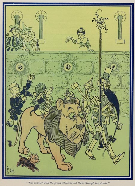
Denslow was one of the original people to illustrate Oz and I really like the fact that he gives the characters more character by illustrating them in a certain way.
For this workshop I was stuck with how I was going to make an educational poster with all the instructions and also connect in the Wizard of Oz. The idea I came up with was to make Toto the Dog into a sort of war hero-esk character whose gone through one Tornado before. To give him more of that american hero look I gave him an eye patch. With Toto as a 'mascot' I could have him tell people the instructions and tackle to brief that way. So I did some quick spot illustrations of some of the instructions, with Toto pointing at them with his paw. Whilst doing this I realised that most of the instructions were about what to do in your home and I thought how I could use this, so to connect not only with the Wizard of Oz but young children, in particularly young girls, I illustrated all the instructions within a dolls house. Also to make it even more interactive for children I made it like an old DIY tornado kit, the illustration will be able to stand up and they can use a hair dryer to stand in for a tornado.
Friday, 21 October 2011
Workshop Six - Terrors of the Night
Research
Alvaro Tapia Hidalgo
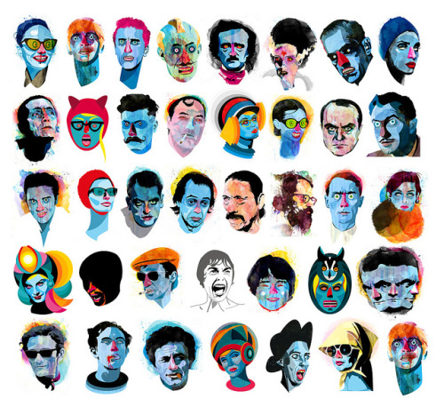
 I really really like the style that this artist has got, the mix of solid black, clean lines with the use of intense colour and drips works really well, also alot of their portrait subject are to do with Horror.
Tom Whalen


In this workshop we had the choice of either doing an exquisite corpse image, full body shot of a character into head, torso and legs, or doing horror portraits of famous characters - Boris Karloff as Frankenstein's Monster, Anthony Perkins as Norman Bates, Christopher Lee as Dracula, Jack Nicholson as Jack Torrance, and Anthony Hopkins as Hannibal Lecter.
I chose to focus on the horror portraits because I wanted to challenge myself for last year whilst doing 'The Great Editorial Race' I realised that I was very poor at doing portraits and want to become better at it. Firstly I started with the portrait of Boris Karloff as Frankenstein's Monster because for me that's one of the most iconic horror images and whilst I was doing this piece of work I researched into Karloff and found out that he was one of the main people in most horror films of a time. Using the images of Alvaro Tapia Hidalgo as inspiration, firstly roughly light boxed around the image and then decided what was going to be blocked black, mid tone, or blank, then filled out accordingly. I then scanned this into the computer and started putting layers of green under the lines, I thought with the multiple lines over where I wanted mid tones this would make those sections look darker but it wasn't as clear as I wanted it to be so I darkened those areas more. I then turned down the opacity on the colour and put drips of blue behind the image, I chose blue because I think it complements with green in the face. To set the whole image off I put a dirty mustard as the background.


Alvaro Tapia Hidalgo
Tom Whalen

I like the simplicity and colour scheme of each poster, just picking out the minimum amount of features to show the characters.
Charles Burns - Facetasm

Burns' style is very horrific especially in the collection of work he's entitled Facetasm where he's used the idea of an exquisite corpse and just focused it on the face. The use of block black and white works well with the horrific images he's creating.
In this workshop we had the choice of either doing an exquisite corpse image, full body shot of a character into head, torso and legs, or doing horror portraits of famous characters - Boris Karloff as Frankenstein's Monster, Anthony Perkins as Norman Bates, Christopher Lee as Dracula, Jack Nicholson as Jack Torrance, and Anthony Hopkins as Hannibal Lecter.
I chose to focus on the horror portraits because I wanted to challenge myself for last year whilst doing 'The Great Editorial Race' I realised that I was very poor at doing portraits and want to become better at it. Firstly I started with the portrait of Boris Karloff as Frankenstein's Monster because for me that's one of the most iconic horror images and whilst I was doing this piece of work I researched into Karloff and found out that he was one of the main people in most horror films of a time. Using the images of Alvaro Tapia Hidalgo as inspiration, firstly roughly light boxed around the image and then decided what was going to be blocked black, mid tone, or blank, then filled out accordingly. I then scanned this into the computer and started putting layers of green under the lines, I thought with the multiple lines over where I wanted mid tones this would make those sections look darker but it wasn't as clear as I wanted it to be so I darkened those areas more. I then turned down the opacity on the colour and put drips of blue behind the image, I chose blue because I think it complements with green in the face. To set the whole image off I put a dirty mustard as the background.

Next I went onto Christopher Lee as Dracula because I wanted to keep with the most well known classic monsters. Again, using the images of Alvaro Tapia Hidalgo as inspiration, firstly roughly light boxed around the image and then decided what was going to be blocked black, mid tone, or blank, then filled out accordingly. I then scanned this into the computer and started putting layers of blue and red (in the areas of blood) under the lines, unlike before with Frankenstein's Monster the multiple lines over where I wanted mid tones did make the sections look darker. Then once again I then turned down the opacity on the colour and put drips of red behind the image, I chose red to make the image look really bloody. To set the whole image off I put a darker blue as the background, I was going to use a black background to that meant the image was lost more.

Subscribe to:
Posts (Atom)

