Saturday, 21 July 2012
Tuesday, 29 May 2012
HE Fashion Show
We were also given the theme of 'Edwardian Plymouth' so we had to create something was quite old looking but also quite now and fashionable which was a bit of a tricky brief but we just slowly pieced it together starting with the top image as the main piece of inspiration then just working parts of the bottom image as well as things like a compass and light to show Plymouth/the sea.
We were also asked to make a mood board on the same theme which again was tricky but interesting because we firstly needed to work out what needed to go on a mood board in the fashion world, but I was very please with the outcome and when we handed in both pieces it was praised which was good and I put my name as Bench Allen on it so it was a good way to spend the name out there.
Easy Fold Book & Box
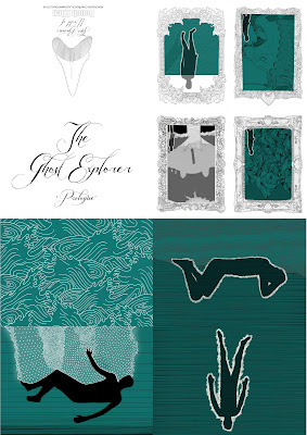
For this project I wanted to find a new way of packaging my easy fold book so I asked Laura if she could show me how to make the boxes she makes for her Resin toys. I decided i'd use cream card for the top of the box and blue for the bottom because it looked like sand/rock and the sea which obviously works for the story of the ghost explorer. I then digitally printed the title on the top and put them together which ended up being very tricky and fiddly without nails but they were done.
I then completed the package with a business card. For the summer show and New designers I was going to make little goodies like laser cut badges and prints in there as well so that it's more of a promotional package.
Monday, 28 May 2012
Tumblr
To get more people seeing my work I joined Tumblr, the good thing about tumblr is that I can put up my art work and other people can re blog it and therefore spend my work around and also I have linked all my images to my blog so more people can look at my entire work. Another thing is that I can re blog other people's stuff so I've been reblogging other people's work on the course (as you can see I've recently reblogged Kelly Walton's work) so that we can all help one another spend our work around.
Subscribe to:
Comments (Atom)


